Thursday 14 April 2011


Initial Ideas

This is my initial ideas diagram that a drawn to show how I want my magazine to be.


Audience Research Results

These are the results of my audience research questionaire.


Location of shots

This is the media room. There was a mixture of white and green screens used.
This made it easy to edit out the colour from behind the image by using the magic wand tool and lasso tool.

 This was the lighting set up used to take the photos. Triggers were placed on to the top of the cameras by using dipswitch technology. The lights flashed when the trigger was pressed on the camera.
 This is the location where I taken the photo of Mitchell playing guitar. I chose this location due to the nice natural light.
This was the piano that was used on my double page spread.


This the room where the piano is.


This is where I took the photo of the mixing desk. It is in the school recording studio.

Pre edited shots

These are the pre-edited images used in my magazine.

This is pre edited front cover image.
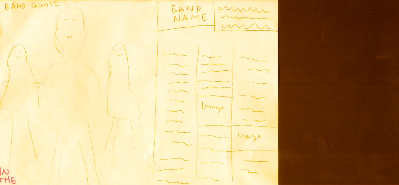

 This is pre edited double page spread image.
 This is pre edited contents inset image.


This is the pre edited image of Ellie Goulding, used on my contents page.


This is the pre edited image of the mixing desk, used in my double page spread.


This is the pre edited image of the piano shot, used on my double page spread.


This is my double page spread main image, retaken so the image is less blurry and more focused.

Photo Planning

Picture
Time and Date
Model/
Pose/
costume
Location
Lighting
Set-up
time
Mise-en-scene
Camera angle + distance
Front cover main image
16 March
Side fringe, checked shirt, looking at the lens of the camera.
School media room
Pro-line lighting kit on quarter power
5 minutes
None
Close up. Straight shot. Camera manually focused.
DPS band main image
16 March
Front man as dominant,others at side.
School media room
Pro-line lighting kit on quarter power
5 minutes
None
Long shot, straight on
DPS inset piano photo
17 March
Actively playing piano.
School music practise room
Black and white, edited
N/A
Piano
Medium shot, from left angle
DPS mixing desk
17 March
Photo of mixing desk in action
School recording studio
Black and white, edited
N/A
Mixing desk
High angle close-up shot
Contents girl guitar shot
21 March
Katie playing guitar with serious posture
School media room
Pro-line lighting kit on quarter power
5 minutes
Electric Guitar
Medium shot, straight on
Contents boy guitar shot
13 April
Mitchell playing guitar outside
Outside D-block area in school
Natural light
N/A
Electric Guitar
High angle, medium close up shot
Contents Ellie Goulding shot (Rena)
7 April
Rena holding a piece of paper showing her record deal
School media room
Pro-line lighting kit on quarter power
5 minutes
Paper
Medium shot, straight on

Monday 4 April 2011

Codes and Conventions

This week I have been looking into codes and conventions of magazines.
I used mostly examples of NME, but examples of Q and Guitar World were also used. This was to give me a broader experience of magazine conventions.


I found this task helpful, because it helped me know typical conventions used professionally. It also gave me lots of ideas that I could use in my own magazine.

Friday 1 April 2011

Rough Cuts

I'm in progress of producing my magazine and these are my rough cuts. This includes a front cover, contents page and double page spread.


Raw
Front Cover

This is the rough cut of my front cover.


The things that I like about it are:

  • Good central image. The Mise en Scene is appropriate. The compositions of the shot is also
  • The front of 'The Bright Nights'
  • The band name
  • Inside circle 
Popular points of feedback from my teachers and class are:
  • Not enough text
  • Image is too dark
  • Inside is in the wrong place
  • 'Nights' clashes with red shirts
  • Good composition of shot
  • Good title and logo
  • No price or issue number

Raw
Double Page Spread

This is the rough cut of my double page spread.

The things that I like about it are:
  • Tri colour scheme
  • Composition of shot
  • Layout of text
  • Inset images
Popular points of feedback from my teachers and class were:
  • Image is too blurry
  • Good colour scheme
  • The way the jeans stand out
  • Inset images
  • Good theme in interview
  • Needs more text
  • Layout of 3rds needs to be clearer
Raw
Contents Page

This is the rough cut of my contents page.

The things I like about it are:
  • Contents logo
  • Fonts used, sans serif and serif
  • Page layout
  • Image
Popular points of feedback from my teachers and class were:
  • Not enough text
  • Needs more content
  • Needs more images
  • Nice use of yellow circles
The feedback helped because it pointed things out that I didn't notice my self. It also gave more opinions on my magazine, all allowing it to help me improve. I will use this feedback in help to produce my final cut of my magazine.